The Chanterelle Cottage Exterior Paint Colors

My husband and I are nine months into construction on our first ever guest experience, The Chanterelle Cottage! That’s long enough to make one whole human baby!
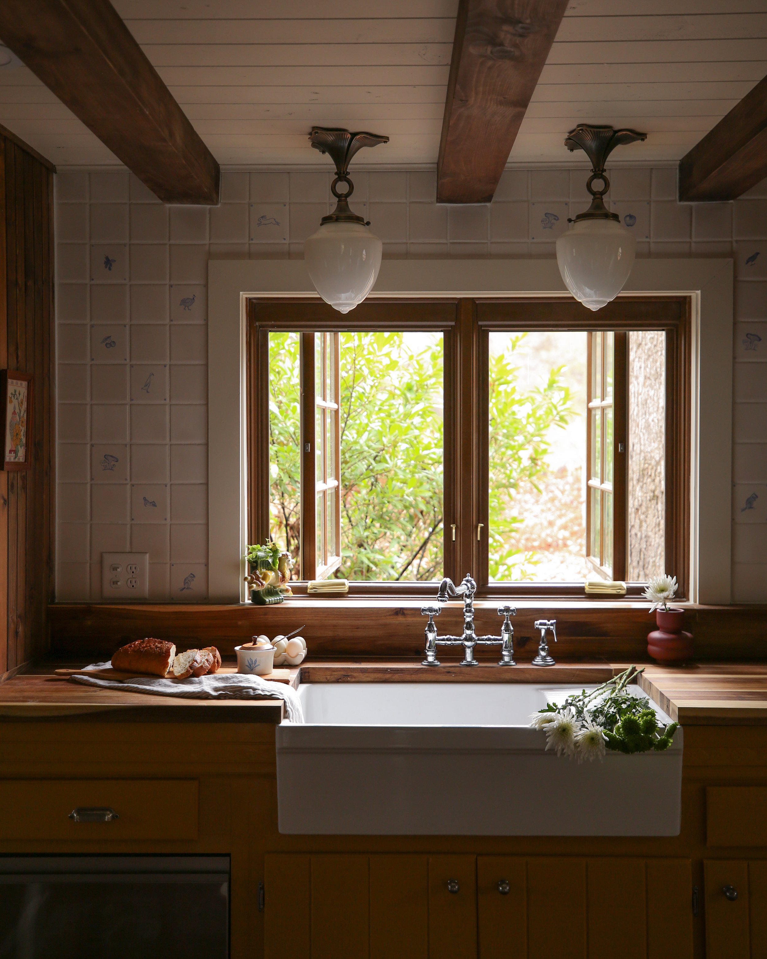
To be honest with you, it’s absolutely been one of the most challenging projects we’ve ever tackled in our years of home design and renovations. It’s our first major project on our property here in Tennessee, and so I felt a lot of pressure to ~ get it right ~ since it’s kinda gonna set the tone for the whole property.
And the biggest scariest decision was picking an exterior paint color. We really wanted something that would do as little as possible to disturb the visual landscape of forest and meadows and for the longest time I thought we’d be doing a stained cedar shake or stained wood siding. Eventually, though, we kinda realized it just didn’t feel like “us.” So then we started to discuss paint colors.
Maybe something a creamy white would feel classic and timeless enough to fit right in on the property? Maybe an earthy brown like Sherwin-Williams’ Urbane Bronze would fit the color story of the surrounding woods?
I let myself slip into the gardens of my day dreams to figure out what I wanted to walk past every day, and what I wanted guests to be greeted with when they first arrived.


The Pinspiration behind this project!
The only thing that felt like it honored our love of splashy colors while still blending into the landscape would be a warm and rich green. A green so lush the cottage would feel like it sprouted from the earth itself, joining its friends in the forest for an eternal hangout.
We sampled Artichoke, Oak Moss, and Secret Garden, all by Sherwin-Williams. While we loved Artichoke, it felt a little too light in color to visually melt into the forest line. Oak Moss was gorgeous too but, like, only felt appropriate if we were painting an army tank. Aside from my love of camo and butch men I try to stick away from anything too army-coded as I don’t find it very relaxing.
Secret Garden on the other hand… it’s velvety and smooth, somehow both bold and demure. Bright enough to be eye catching but dark enough to allow the shadows of the leaves to dance on its surface as the sun makes its way across the horizon.
I am absolutely in love, and it feels so us.
We landed on Casa Blanca for the window trim as it very closely matched the color of the windows themselves. I love the little pops of white it gave the cottage.
Oh! And if you’re curious we used a satin finish on the siding, semi-gloss on the fascia, and semi-gloss on the window trim :)
Thanks for stopping by the blog and I’d love to know what you think!
xoxo
Beau


You might also like