"Modern Victorian" Design Inspiration For Our New Orleans Home
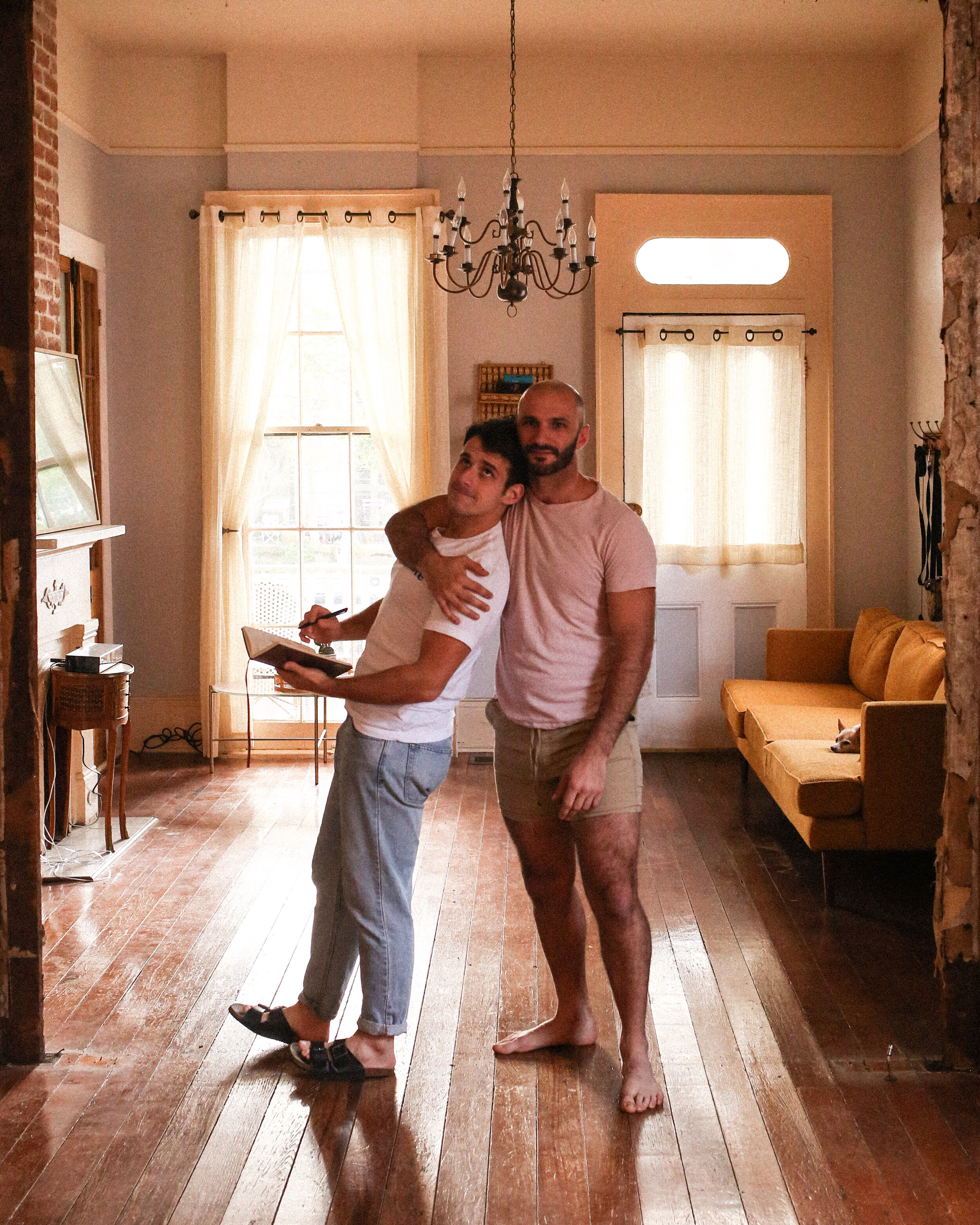
It’s a slight construction zone right now, but we’re getting there!
Hello friends! We’ve been kinda quiet on the blog because we have been knee deep in projects around the house—figuratively and literally—that aren’t really internet worthy. Not much pretty stuff going on over here, yet! So much of these first six weeks in our home have been about learning about the house and how we like to live in it. Something I’d really recommend doing in a new home before any big renovation or redesign, if you can!
And we’ve learned a lot. We’ve learned that our favorite part of the home is the upstairs, which is nestled by a big oak tree and is flooded with natural light from dusk to dawn. We’ve learned which windows leak (office window, bonus room window) and which floor boards creek (right side of dining room). We’ve learned our home is full of little treasures, mementos of the last 130 years, and also lots of junk. Like, a LOT of junk. This phase has been exciting—like when we figured out the attic was absolutely large enough to accommodate a fantastic upstairs closet—and also exhausting, like the number of days we’ve just been covered in mud, sawdust, and/or sweat.
We’ve finally gotten to a point where all the things have been more or less discovered, and it’s time to dive into the redesign and decorating. We’ve got architectural drawings being done, contractors working on bids, paints being sampled, and we’re beyond ready to dive into making this house our home. Which brings me to the topic of discussion today! Our design direction for our home.
We don’t really believe in subscribing to specific design aesthetics. Folks are so eager to label their style as “modern farmhouse” or “boho chic” or “Scandinavian” and I think that’s fantastic if it works for you, but in general I’ve found labels work best for products and not people. Plus our style tends to be extremely fluid, constantly evolving, and largely informed by the space we’re working in.
Regardless of the actual style itself, there are a few mainstays of our designs. We like to be bold. We like to do something unexpected, whether it be an oversized chandelier, yellow couch, or a built in kennel for Fox. We like quirk, and we like a home to feel lived in—never sterile.
This house is going to be getting a facelift in a design style that is new to us. Victorian-inspired charm and glam with modern touches. I think the Emily Henderson team maybe coined the term “Modern Victorian,” but I’ve now been seeing it floating around the internet more and more. It basically refers to any design that leans heavily on Victorian mainstays, like fringe, tufting, molding, or bold color, while incorporating modern elements that make the home suitable for everyday living and also keep it from feeling like grandma’s closet.
Our home was built during the Victorian era, and like many of the shotgun homes around New Orleans, the Victorian attention to intricate detail is present in the beautiful woodworking of the front porch’s columns and trim. But inside, things get a little more utilitarian. The structure itself and the framing within it is pretty simple. And while the original pine floors and double hung glass windows are a dream to have now, at the time the house was built they would have just been the standard. So this house has had over a century of being gorgeous on the outside and having great bones and components on the inside, but stylistically has never really been treated like the pageant girl she is. And that’s about to change! We want this home that has stood around for so long to be given a redesign that appreciates it, nurtures it, and most importantly, flaunts it.
We want to add bold colors and molding and wallpaper that don’t distract from the original features, but highlight and elevate them to create gorgeous cohesive spaces that change and evolve as you move through the home. From walking in the front door to stepping out into the back garden, we wanted our home to feel like an adventure.
Let’s look at some of our current favorite inspo!
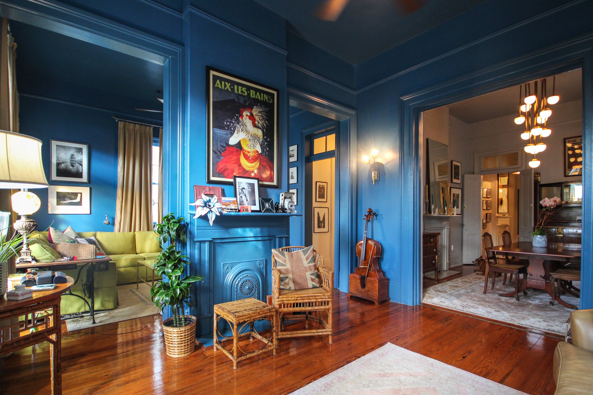
When we first confirmed we were purchasing an old New Orleans double-shotgun home, I immediately took to the internet to see what sort of design-forward things other folks had done with this style of home. I came across this home (image below) by Celeste Marshall and immediately fell in love. The two rooms pictured here are the front two street-facing rooms of the house, so the exact same as our living room and office. We have two sets of French doors on either side of our fireplace whereas the walls in her home have been completely opened up. I love love love that she went for a high-shine dramatic color for the entire space for a monochromatic moment.
The below room… is seemingly a home bar? OK, work. I’m obsessed with the archway, floral wallpaper, brass accents, and overall moodiness of the room. Like, is that a black ceiling? I love that the drama of the room’s color choices and wallpaper are balanced out by its simple molding and styling.
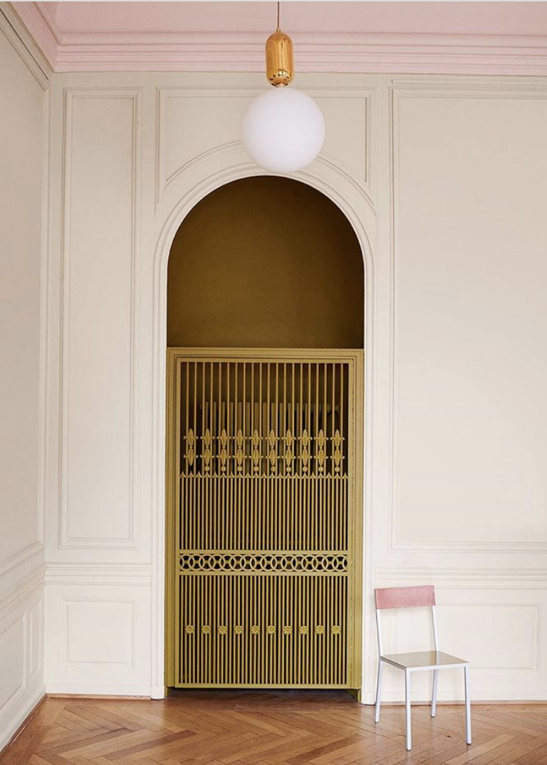
Clean lines, bright colors, and this half circle archway all decked out with decorative moulding is a huge inspiration for me. We love moody Victorian, but using elaborate elements in a room that is light and bright feels especially playful and inviting. This is something I’m planning on doing in our living room. While Matt’s office will be a sophisticated serve, I’m planning to make the adjacent living room feel a little lighter.
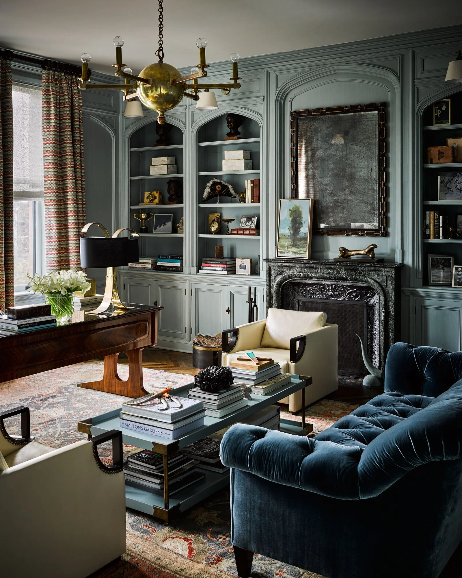
Here’s a look at something more moody, like we might be seeing in Matt’s office design. The old world style, tufted sofa, unexpected curtain pattern, and bookshelves styled with antique finds all come together to make this room feel like the perfect place to sign contracts and hang up on people.
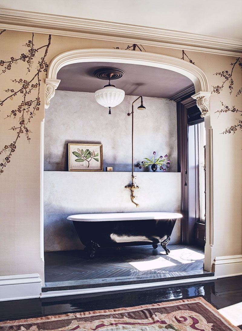
The below combination of an ornate archway, plaster, exposed piping with minimal styling and clean lines is absolutely drool worthy and totally nails down the modern Victorian feel. Elements of the room look like they were plucked from the 19th century while the space as a whole has a distinctly up-to-date vibe. Also, the whole clawfoot tub in the bedroom thing? We’re probably stealing that.
Oil paintings, wallpaper, and high gloss paint in the below bathroom make for a room that feels quirky while still being luxurious. Love it. We haven’t quite figured out what we’re doing to our guest bathroom (or when we’re even going to do it!) but seeing such a bold small space has got me itching to get on it. But, it’s definitely a 2021 project.
Contrast between the soft blush and rich blue wall colors, floral details on the chandelier, and pocket doors all make this room a stunner. One of my favorite elements of our home is that many of the rooms open up to one another via large doorways, but each room is still very distinct—so, not an open floor plan. This is fun because it allows us to make each space super unique and distinct in a way that isn’t really advisable in an open floor plan.
And that’s that! Let us know what you think about this direction and if you have any modern Victorian favorites! Appreciate you stopping by the blog :)
xoxo
Beau (& Matt!)

