Modern Forest View Living Room (Our Tennessee House Sunroom!)
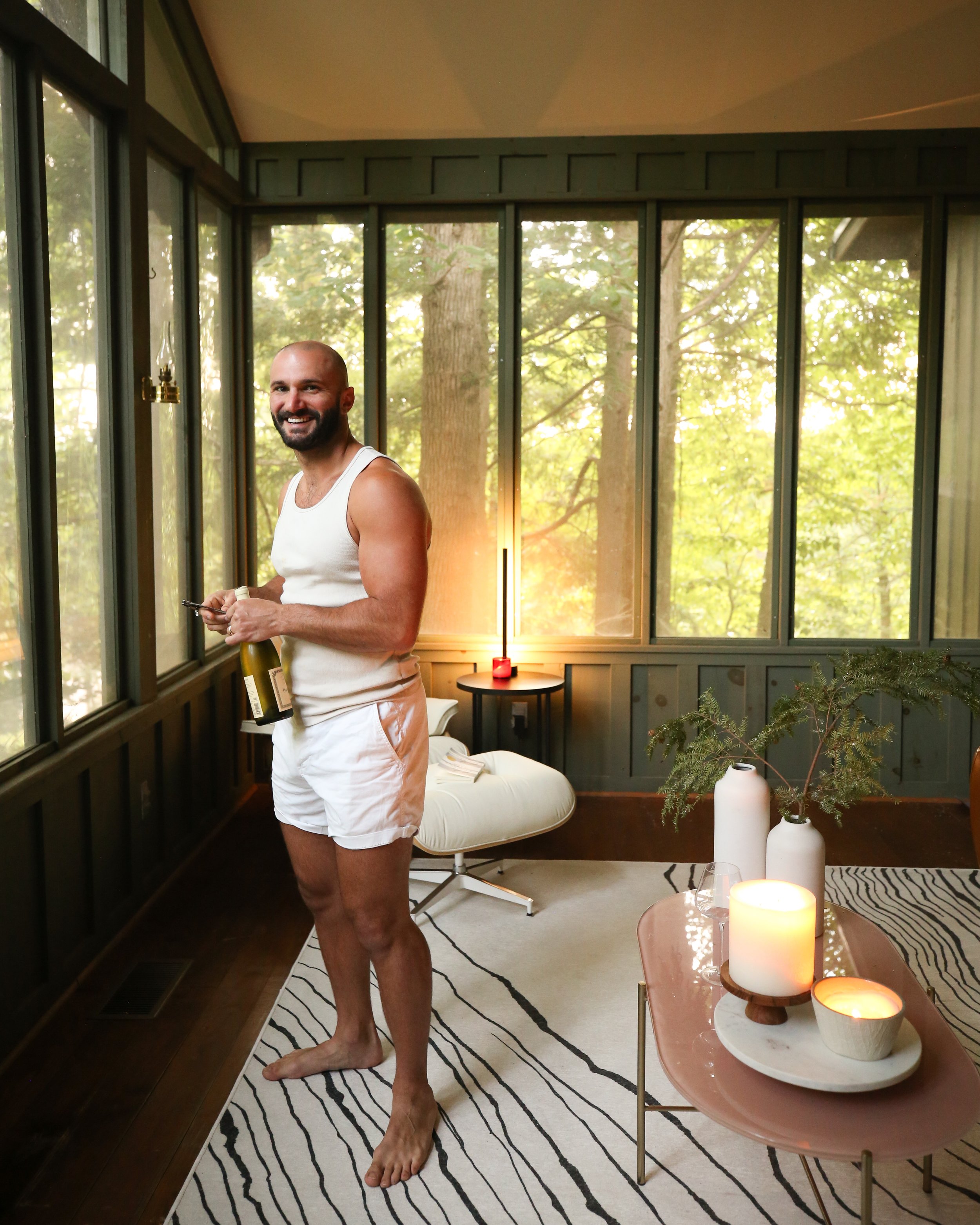
There were a lot of spaces in the Tennessee house that had us stoked long before we even arrived–the kitchen with the original (functional!) wood burning fireplace, the ginormous wood-panelled room with soaring ceilings that will make the most incredible library, the covered porch that overlooks the grove of trees in the front of the home–but I think we were both most excited about this sunroom living area that connects to our primary bedroom through large French doors.
While viewing the real estate listing early on, it was one of the first rooms that made me do a double take, and the room I thought of most often whenever we would go back and forth on whether or not the house was right for us. Unlike the long and narrow entrance sunroom, this space has air conditioning and is on the same a/c system as the rest of the home, so it feels like an interior space even though it’s almost entirely made of windows and looks like it could be just a really gorgeous covered patio. It looks out onto an overgrown grove of trees, and is the most relaxing place to read a book before going to bed just a few steps away, and the best space to pass through on the way to my morning coffee.
And at dusk, the warm streaks of sun pass right through this room, while the fireflies get all blinky and it makes me feel like….wow I can’t believe this is our home.
As we’ve talked about the design and decoration direction for this new house, we’ve had to dig a little deeper than usual to figure it out. One of the ways we often start designing a space is by leaning into what the home’s architecture is already doing, but that’s not so cut and dry here. The oldest part of this home was built in the 1930s or so, and then added on to over and over again, each space constructed seemingly independently of the other, perhaps just to the taste of the times or the person doing the addition. Throughout the home you’ll see spaces that feel distinctly farmhouse; some that lean grand, almost like a chalet; and others that a reminiscent of the modern mountain houses you’ll see throughout the Blue Ridge mountains. Our goal is to let these spaces keep their character but to use paint, decor, and common materials throughout the home that will help add a bit of uniformity that is currently missing from the home as a whole.
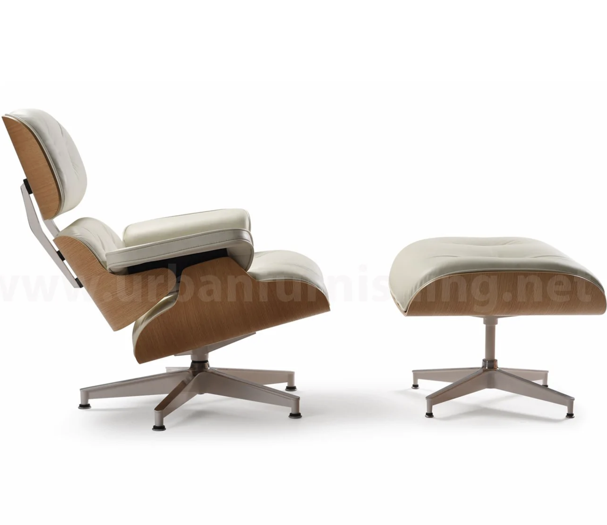
This particular room certainly has a “modern mountain home” feel to it, moreso than any other room in the house, and so we plan to further lean into that one day soon with a refresh that will include a coat of sleek black paint, updated lighting, and a few new furniture pieces. For now though, we’re loving it even just styled with a few of our “leftover” pieces we brought from New Orleans, in addition to a couple of new items like the ivory “Eames” chair lookalike.
Below I’ve got more from around the space, as well as links to a few of the items we’ve used and a rendering made by Matt showing our future plans!
Our rendering for the room’s final design
Hoping to have this space done by the end of year!
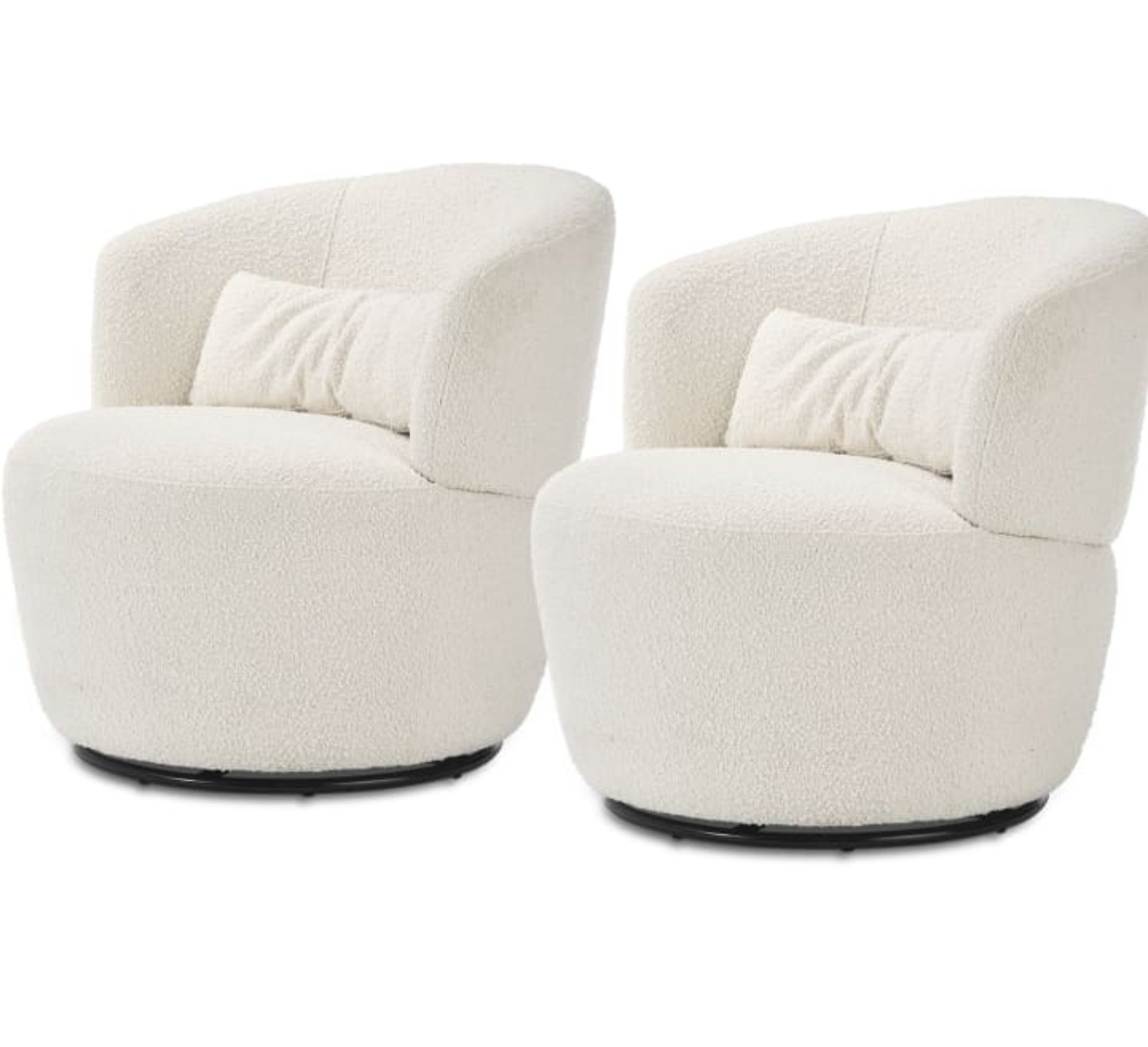
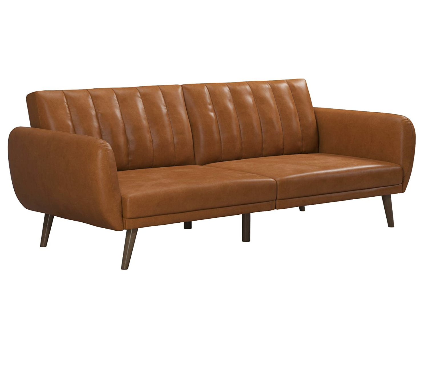
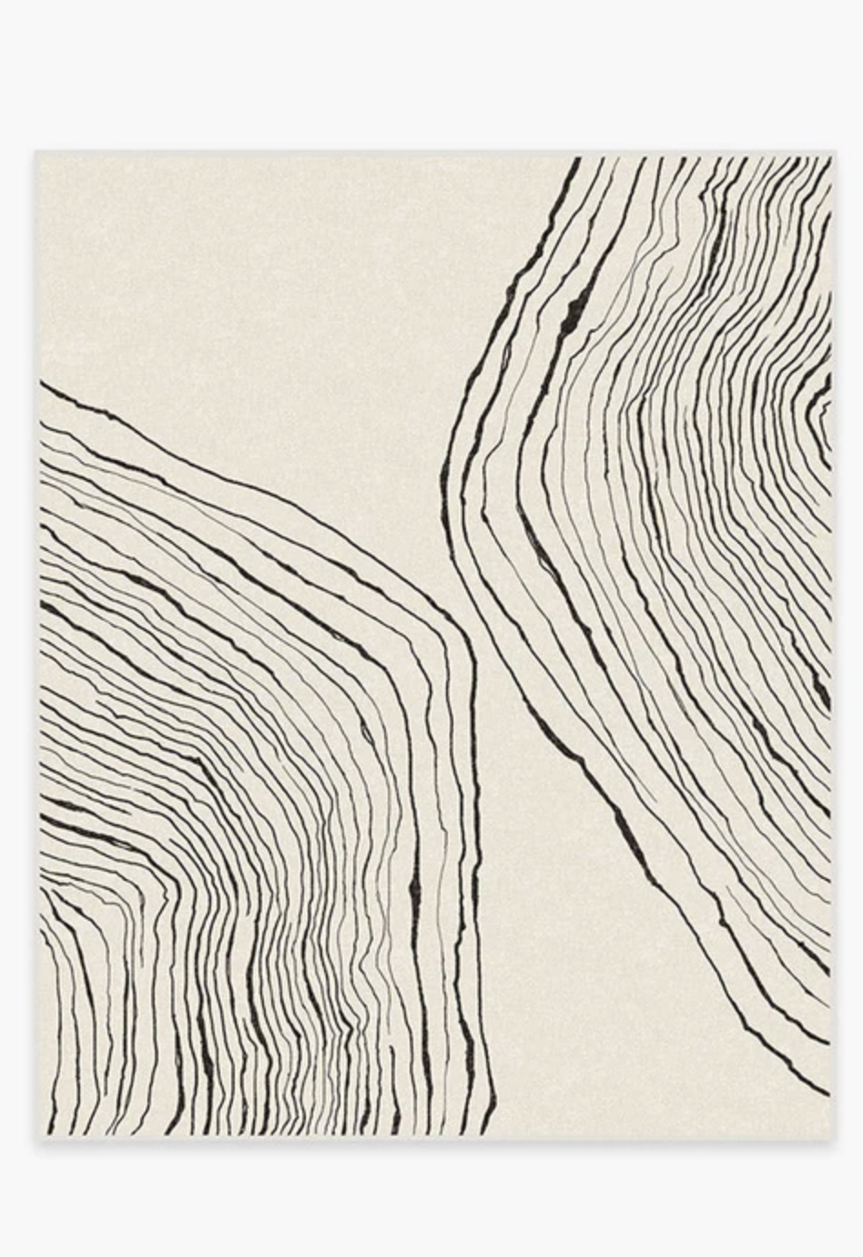
Shop the items
Thanks for stopping by the blog!
XOXO
Beau, Matt, Fox, Barley, & Rye!


